When we organised our first conference #NAMA — and that was the only one we did — it was almost in defiance. For a tiny little team like ours (4 or 5 people then), the idea of running editorial and then organising a large conference, was scary. We knew all potential speakers and all potential speakers knew us. We had never figured out costs for a large conference, never negotiated with a hotel. We had done small events where we had left it to the sponsors to pay the venue directly, and we took a management fee. So it was all new. It was all scary.
How we made that happen is a story for another day, and I’ll tell it sometime, but in my mind it wouldn’t have happened if Vijay Shekhar Sharma hadn’t gone out of his way to come and see me in CP, and help me clear my head and literally made a plan and an agenda on the fly. Vijay is a yaaro ka yaar, as they say, and he came through for me that day.
In the middle of all of this chaos, I wanted to define an identity for MediaNama’s conference: for it to be an annual conference on the lines of the D Conference (which, for me, was a benchmark), and for it to be something that people remembered us for. The name that I had been thinking about for years was “Converge”. It represented the fact that we wanted to be a conference were people come together, and convergence is a telecom+internet phrase. I had an intern design a futuristic logo as well, in 2009. But somehow, it didn’t quite fit for me. There were several conferences globally called converge or convergence, and then there is an Indian conference called “Convergence India”. Finally we zoomed in on NAMA. People referred to MediaNama has Nama in conversations, and the first person I remember calling it Nama in a conversation with me was Sameer Pitalwalla, another old friend in the space. But what made this different. I also thought that we needed a visual symbol, and looked to incorporate the hashtag. At that time, MediaNama’s primary focus was tech, and not tech policy, so we thought we could extend the brand. So the conference was called #NAMA, and if we ever did something on the video industry, that would be VIDEO#NAMA, or on music, would be MUSIC#NAMA. I had some of these domain names, so building independent brands wouldn’t be bad idea. We never did this.
But back to the design, I wanted a design that would stand out. My first plan was a repeated hashtag. So I pinged a designer friend, paid an initial amount, and filled out a long brief within a day about what we wanted. Then she went AWOL. After a few days I got awful designs that in no way reflected how I thought about it. By the time I got through with this designer, we had lost 10-12 days, had 20 days to go for the conference, and with a small team, with mostly me trying to figure out speakers, sponsors, designs, speaker gifts, and much more, without what I wanted as an iconic design in place, I thought it was all falling apart. That evening, after I politely told the designer that we would go elsewhere and she can keep the deposit, I called up another designer friend: Himanshu Khanna of Sparklin.
30 min after my call with Himanshu, I got a lovely, calming email from Deepikah, who led design there then, telling me that she’s got it covered. A few days later, we met at a hotel to discuss it, and she already had 3 options of design that I liked. The backdrop was a bright yellow, with repeated hashes of white, offwhite and yellow. Another had a yellow background with strange pipes of sorts all across the design. The third had a yellow background with all sorts of internet centric emoticons combined.
I looked at all three, and I liked what they brought to vibe of the design. Much to Deepikah’s shock, I asked her to combine the three. I wanted chaos and unpredictability in the design. I didn’t want the basic boiler plate designs. Like an intricate piece of art, I wanted that people to spot something new every time they looked at it, or every part of it that they looked at. Something, that even if people saw without the logo, they’d know its ours.
It’s something that I will always be thankful to Himanshu and Sparklin for: they didn’t just save us at a time when we were left in the lurch, they also gave us a design that I personally love. To me it’s art.
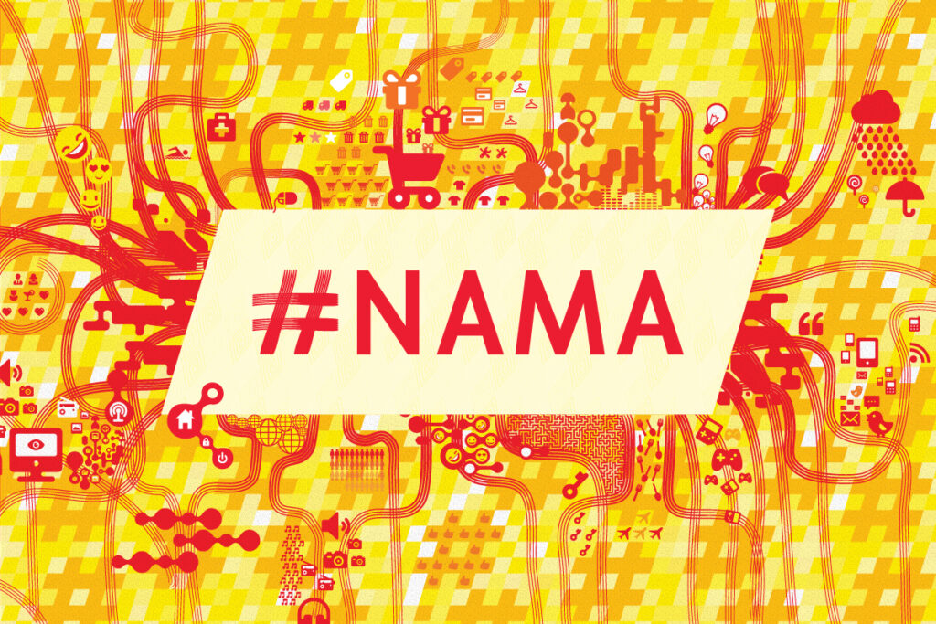
We’ve done several MediaNama events since, and the design, at least offline, has remained the same. It’s been difficult to make this design work over a period of time, for venues of different sizes, because of the lack of repeatability.
So we’re simplifying it now…there’s enough chaos in our lives already, isn’t it? 🙂 I just wanted to leave this here, as a matter of record. I still love this design.